Field notes
6 min read

Yannis is an engineer at November Five with a soft spot for frontend and a habit of taking on whatever's blocking the team. Off the clock you'll find him climbing, at the gym, or out walking his dog.
A DatoCMS field plugin: free-text icon field becomes a searchable grid of all 1,179 Untitled UI icons.
Icon list generated from @untitledui/icons at build time, so it never drifts from the design system.
Value still stored as a string, so no schema change. The CMS cannot hold a name the frontend cannot render.
Design later wanted 01, 02, 03 on some blocks. Numbers added as an opt-in global plugin parameter, off by default, no fork and no client-specific code.
The real unlock isn't the picker, it's treating the editor as a user: competence and security are experience goals too.
Open source on the DatoCMS marketplace and npm, MIT.
The problem
On a recent project the whole frontend was assembled from blocks in DatoCMS. Feature grids, storyline sections, metric callouts, service navigation. Each one had a small icon next to a heading. The design system used Untitled UI icons, so the set was fixed and known up front.
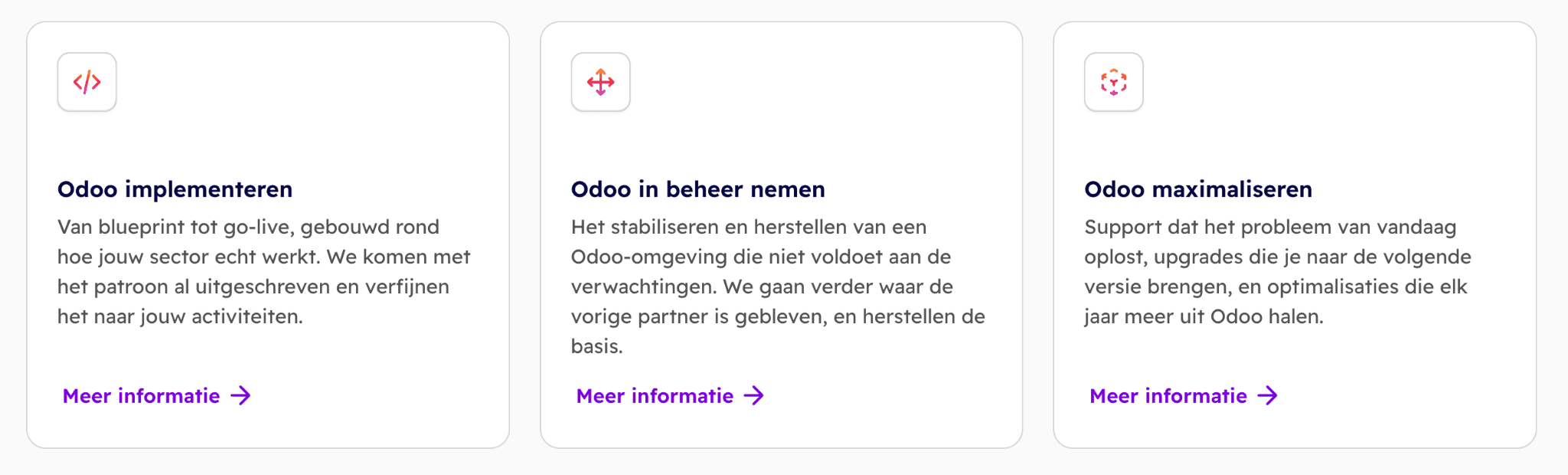
The naive way to ship this is a plain string field. You tell editors "type the icon name" and you write down the rule somewhere in a Notion page nobody reads. It works in the demo. Then in month two you're debugging why an icon isn't rendering, and the answer is that someone typed “ArrowRight” where the component is exported as “ArrowRight01”. There is no autocomplete, no validation, no preview. The CMS knows nothing about what a valid icon is, so every mistake is invisible until it hits the frontend.
We didn't want a documented convention. We wanted the CMS to make the wrong value impossible to enter.
Phase one: a real picker
So we built a DatoCMS field editor plugin: datocms-plugin-untitledui-icon-picker
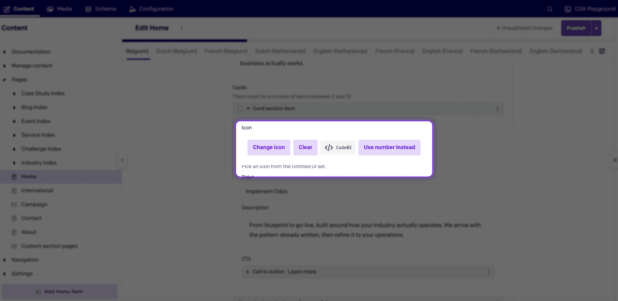
Attach it to any single-line string field and the editor gets a Pick an icon button instead of a text box. That opens a searchable grid of the entire Untitled UI set, all 1,179 of them. You see every icon rendered, you type a word, the grid filters as you type.
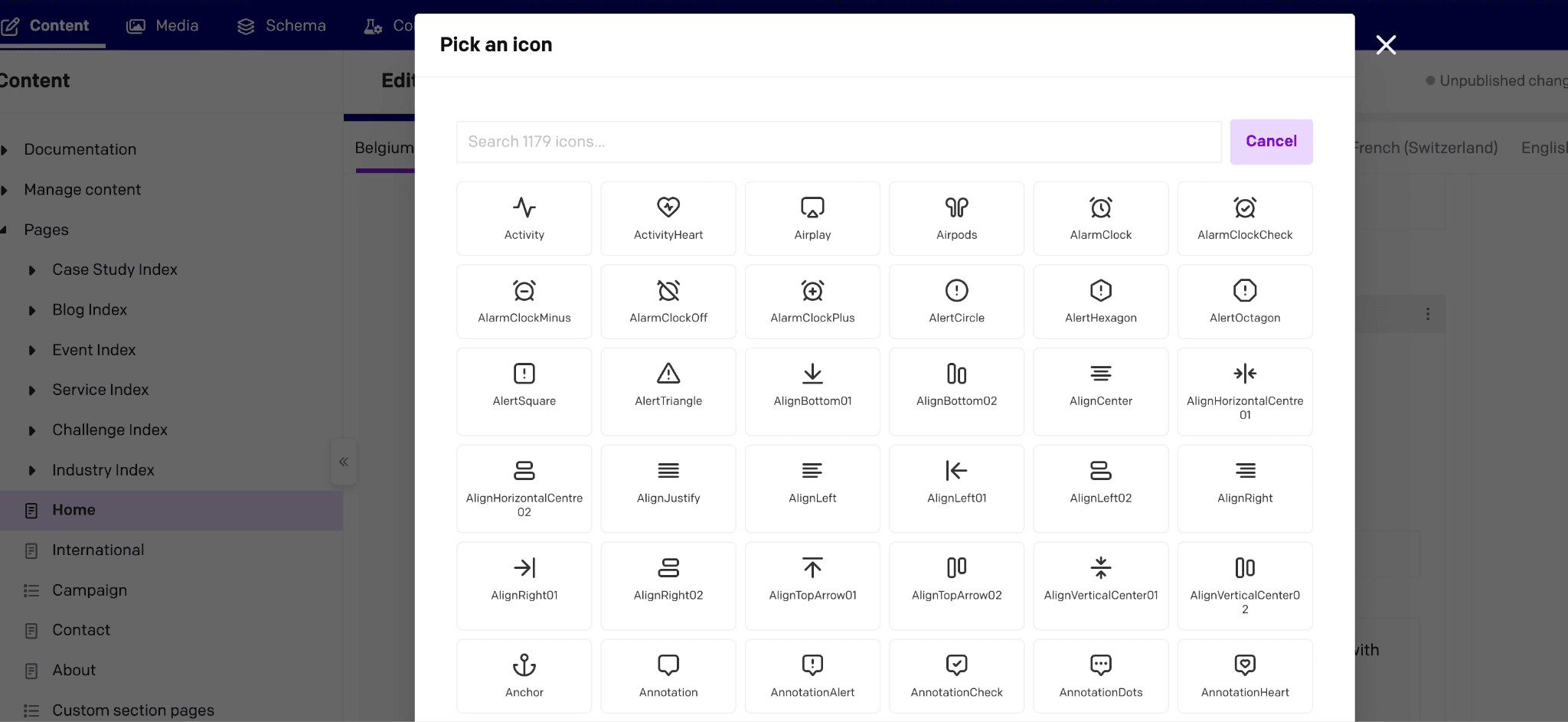
The icon list itself is generated from “@untitledui/icons” at build time, so the picker always mirrors exactly what the design system ships. No hand-maintained list to drift out of sync.
Under the hood the field still stores a string, so DatoCMS is happy and the schema doesn't change. The string is a JSON-serialized object:
The frontend parses that and resolves “icon” to the matching React component. The value is either a real icon name or nothing.
Phase two: design added numbers
Then a later design iteration landed. Some of those blocks, a "how it works" storyline and a set of steps, didn't use icons at all. They used numbers. 01, 02, 03,… next to each step.
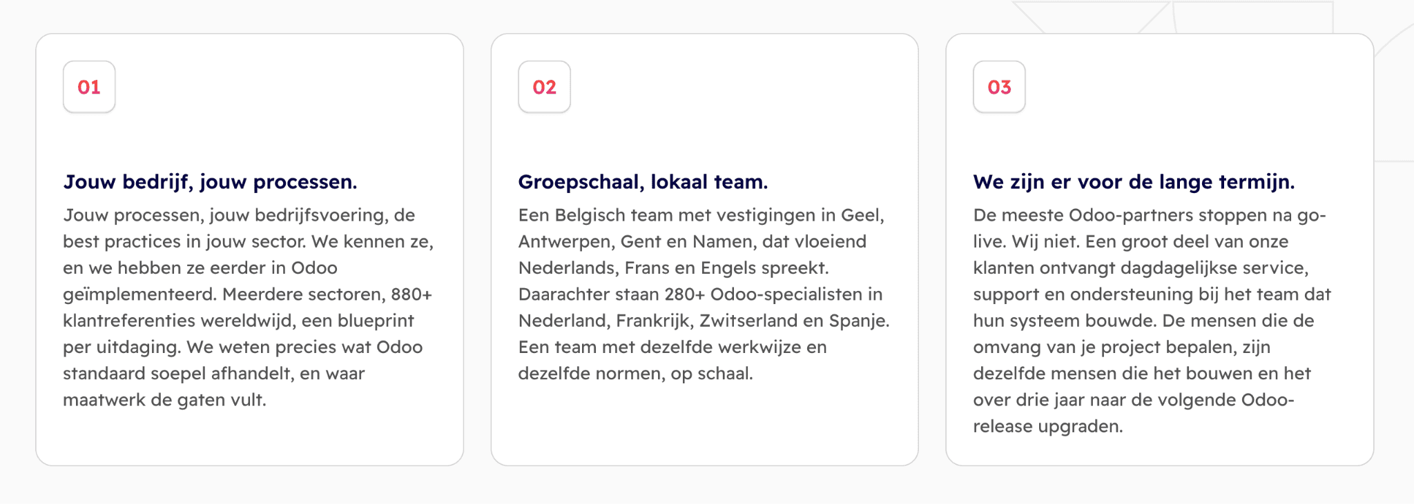
We wanted to give this client the choice between an icon and a number. We didn't want that choice to leak into the plugin and turn it into client-specific code.
That's exactly what the plugin's global parameters are for. A DatoCMS plugin gets a per-installation settings object through its SDK context, “ctx.plugin.attributes.parameters”, plus its own config screen to edit it. So the config screen writes a single flag:
Every field reads that flag back off the context when it renders:
With numbers enabled, the stored value carries the extra state:
The flag is off by default. A fresh install of the plugin is a clean icon picker and nothing else. You have to walk into the settings and deliberately switch Allow number input on before any field grows the extra Use number instead button.
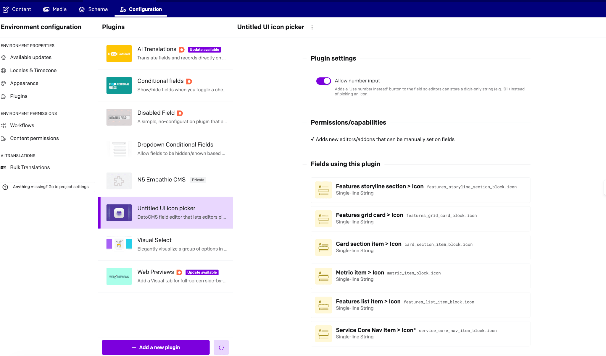
That default matters because the plugin is public. It's on the DatoCMS marketplace and on npm, named after a well-known icon package. Someone installing "the Untitled UI icon picker" wants an icon picker. Numbers are there for the people who need them.
Why public instead of private
DatoCMS lets you host plugins privately: point a project at your own dev server URL and it's yours alone. We use that constantly while developing, and it would have been the path of least resistance here too.
We made this one public on purpose. It isn't project-specific. It wraps a known, widely-used icon set in a generic way, and also we wanted to contribute back to the plugins that we use so often.
The editor is a user too
The person editing the CMS is having an experience, and it's one nobody designs for. We have a framework for that at November Five: MX, for Memorable Experiences, which asks which moments deserve to be remembered and which motivations they tap into. It normally gets pointed at the end customer. Point it at the editor and two of those motivations show up immediately.
Competence: can I do this well, with confidence? A picker that can only emit valid values means the editor never second-guesses a spelling. Searching a grid of rendered icons is faster than remembering which suffix a component has.
Security: can I trust this and relax? When the CMS refuses the invalid value up front, nobody is left wondering whether something is broken on the live site.
A free-text field is technically fine and hostile. A picker is a small moment where the tool has your back, and the person on the other end of it runs this thing every day.
The plugin is open source and MIT-licensed: GitHub · DatoCMS marketplace · npm.
